Visual Merchandising: The Guide to Staging a Store That Makes People Want to Buy
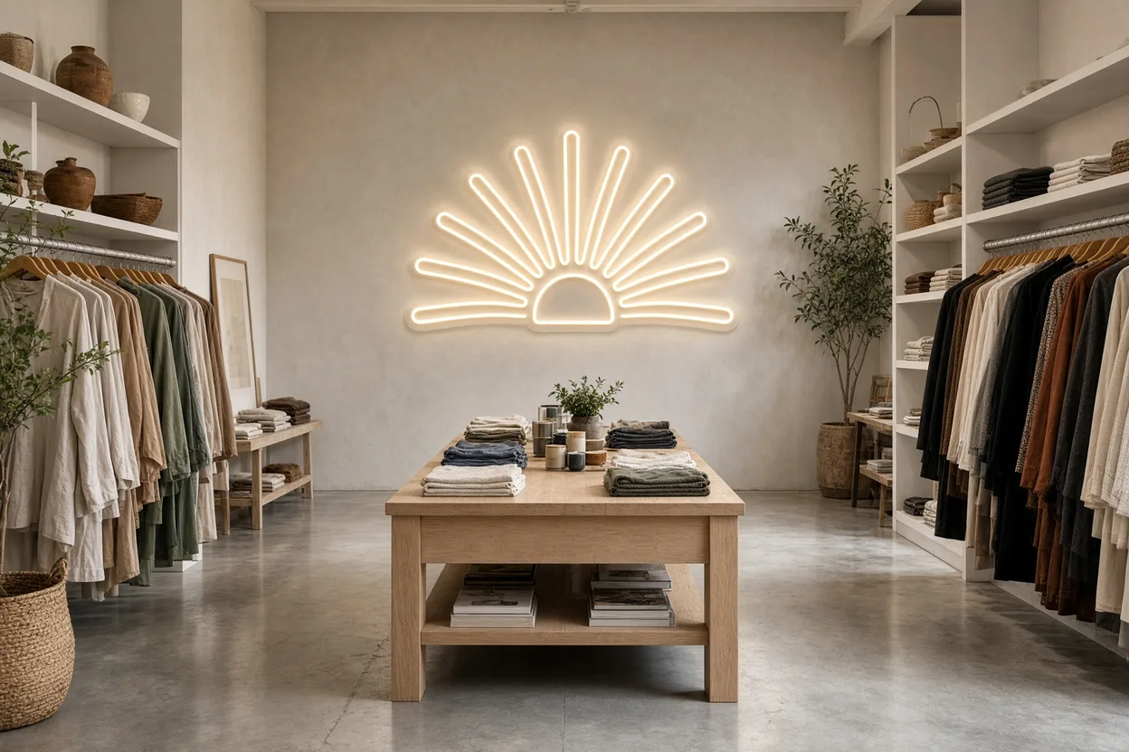
- Visual merchandising stages a store so shoppers stop, walk in, and buy. With 76% of purchase decisions taken in the store, window displays, layout, lighting, and signage turn browsing into sales.
- You get the pillars, hot and cold zones, window tips, lighting roles, and a five-step strategy.
crostrong>Visual merchandising brings together every technique that stages a retail space to stop passersby, guide them through the store, and trigger a purchase: the window display, floor plan, product presentation, lighting, and signage. At Helioneon, we make custom neon signs used as focal points in boutiques, and this guide is for retailers, store designers, and multi-location brands that want a clear structure for how their space is staged.
A tidy store is no longer enough to sell. Shoppers compare, browse, take photos, and often decide on the spot: that is where staging makes the difference. With more than 500 neons delivered, including a growing share for concept stores, fashion boutiques, and franchise locations, we see every week what stops the eye inside a store. Here are the principles that work, and how to put them into practice.
What is visual merchandising?
Visual merchandising is the part of merchandising that acts on what the customer sees: the look of the window, how products are staged, lighting, colors, and the path through the store. Merchandising in the broader sense also covers assortment, pricing, and quantities; the visual side turns that offer into an experience.
The role sits at the crossroads of design and commerce. A visual merchandiser works with brand codes, but also measures how choices affect sales. In a small boutique, the owner often handles this role, while larger chains have dedicated teams that roll out one concept across every location.
- Merchandising: what to sell, in what quantity, at what price, and where
- Visual merchandising: how to show it so people want to buy it
- Goal: stop the passerby, get them inside, guide them, trigger the purchase
- Settings: boutiques, big-box retail, showrooms, trade stands, shop-in-shops
The English term is standard in retail teams worldwide, and it means exactly this visual side of merchandising. For a store designer, the challenge is to plan early for the supports that keep that staging alive: free wall space, power supply, lighting tracks, and flexible window positions.
Why does visual merchandising drive sales?
Staging sells because a large share of decisions happens in the store. According to a study by POPAI, the international point-of-purchase marketing association, 76% of purchase decisions are taken in the store, nearly one branded purchase in six happens when a support for that brand is present, and 66% of products picked up end up in the basket. To go further, our guide to sensory marketing shows how to combine light, music and scent.
Shoppers therefore do not follow a fixed list: they react to what they see. A product featured at eye level, a well-lit table, or a window that tells a story triggers impulse buys and extends time spent in the store. By contrast, a confusing or poorly lit aisle sends the customer out without finding what they came for.
- Attract: a window that stops the passerby in a few seconds
- Get them in: a clear, uncluttered entrance
- Guide: a path that reveals the full offer
- Convert: products that are accessible, well presented, and well lit
Staging also builds brand image over time. A customer who remembers a décor, an atmosphere, or a lit wall is more likely to come back and to talk about it. For physical stores, that is an advantage online retail cannot copy.
What are the pillars of visual merchandising?
Visual merchandising rests on five complementary levers: the window display, store layout, product presentation, lighting, and signage. Each plays a precise role in the journey, and their consistency creates a recognizable brand atmosphere.
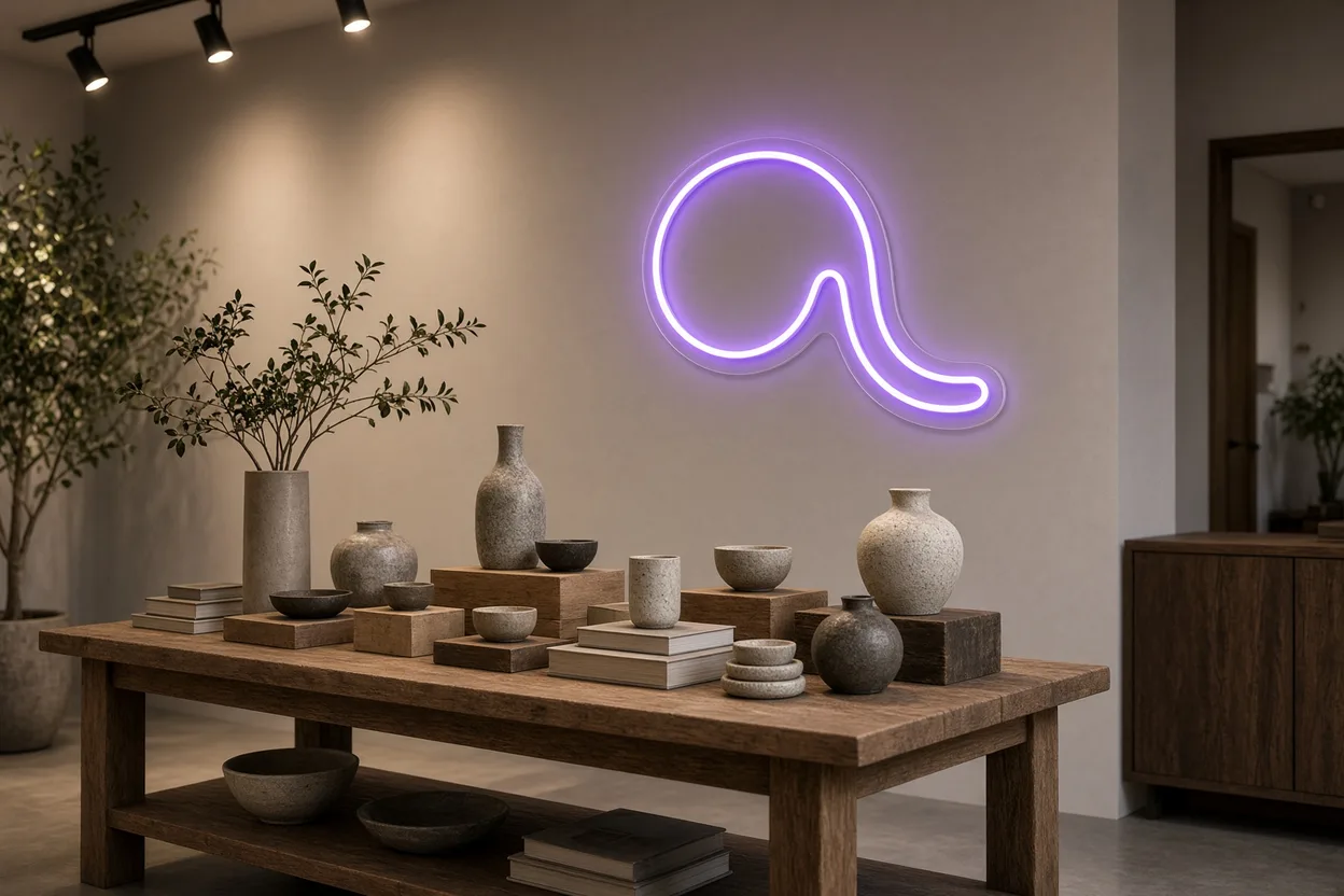
The table below summarizes these levers, their role, and a store example. The lit focal point comes first because it serves the window, the path, and brand identity at once.
| Lever | Role | Store example |
|---|---|---|
| Lit focal point (LED neon) | Draw the eye and sign the brand | Logo or slogan at the back of the store |
| Window display | Stop the passerby, announce the world | Seasonal staging |
| Layout | Guide the customer through the full space | Call-out zone, main aisle |
| Product presentation | Make the product desirable and accessible | Themed table, display fixture |
| Ambient and accent lighting | Create atmosphere, reveal products | Adjustable spots on new arrivals |
| Signage | Orient and inform | Department signs, readable prices |
These levers are managed together. A strong window that opens onto a poorly lit store disappoints, and a well-planned path loses impact if products are shown with no hierarchy. That is why chains formalize rules in a merchandising guide that every location applies and adapts.
- Consistency: the same colors, materials, and tone across every lever
- Hierarchy: one main message per zone, not ten
- Rotation: staging refreshed with each collection cycle
- Measurement: sales tracked before and after every change
Hot zones and cold zones: how do you organize the store?
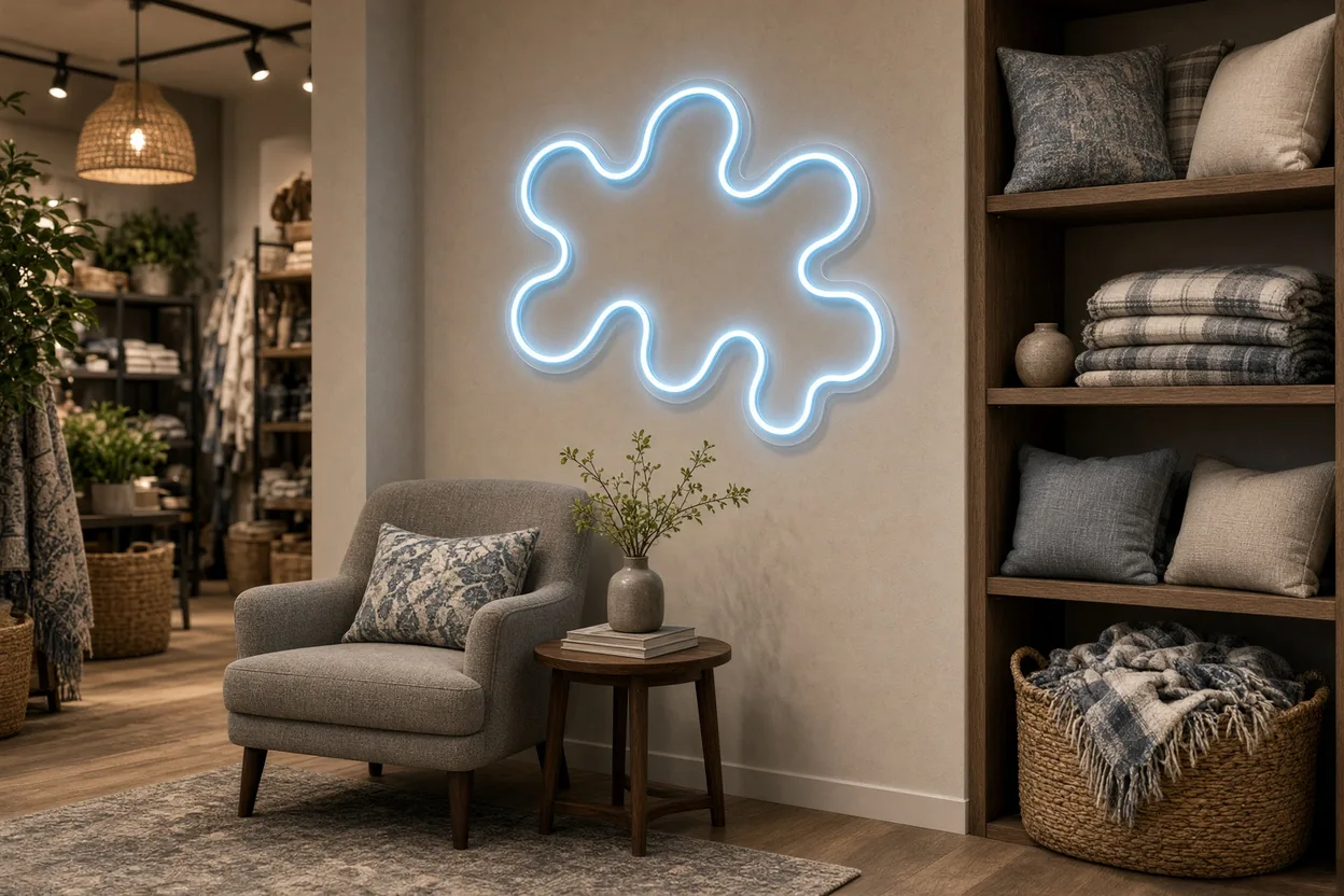
A store splits into hot zones, which shoppers naturally visit, and cold zones, which they avoid or overlook. The goal is to use the first for hero products and to warm up the second with elements that pull the eye, such as a lit focal point or a strong display.
Hot zones are usually the entrance after a few steps, the main aisle, the checkout, and endcaps. Cold zones often sit in corners, at the back of the store, and in dim recesses. Shopping behavior specialist Paco Underhill showed in his book Why We Buy, published in 1999, that customers need a transition zone when they enter, and that they tend to move to the right.
- Transition zone: the first few feet, where you avoid placing key products
- Call-out zone: just after, with new arrivals and best sellers
- Main aisle: the spine that walks shoppers through the offer
- Back of store: a lit element or strong display to pull customers there
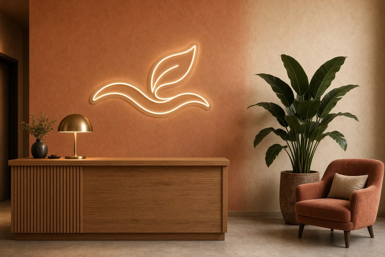
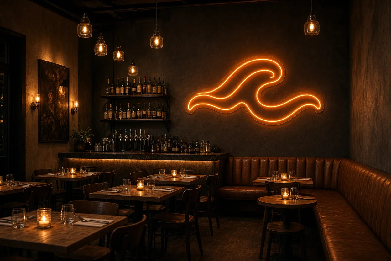
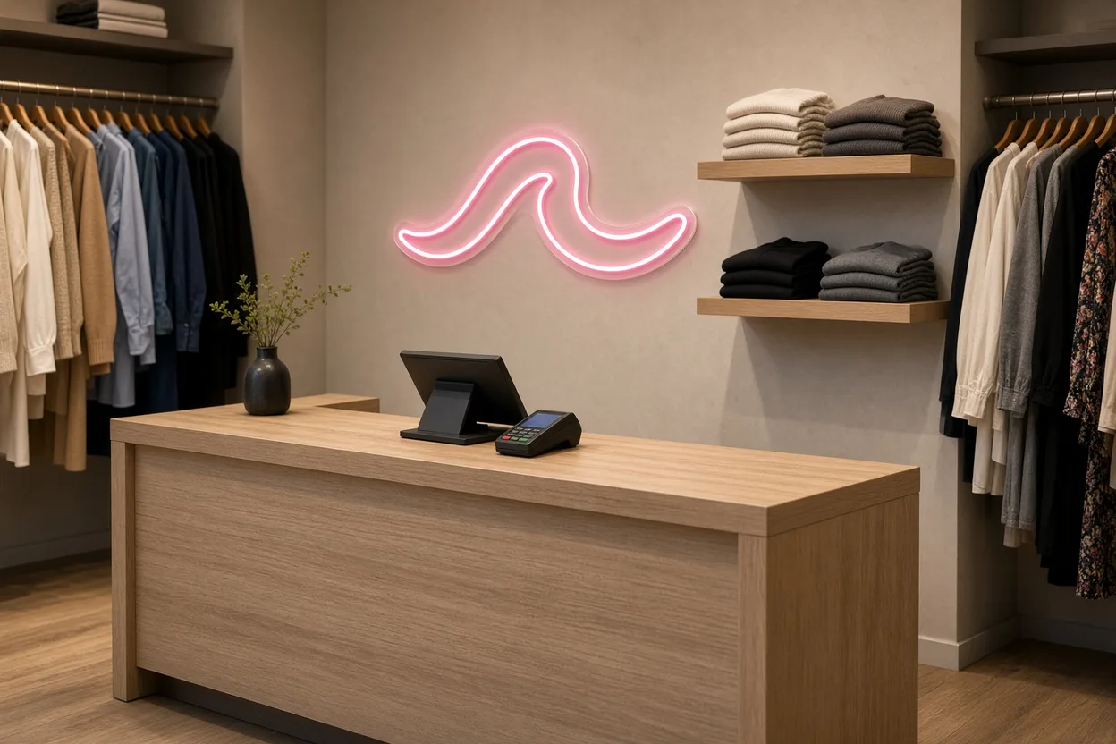
To warm a cold zone, lighting is often the simplest lever. A neon with a strong word or the brand logo on the back wall pulls the eye from the entrance and gives a reason to cross the store. And because it uses little power and lasts a long time, it can stay on all day without a notable cost.
How do you create a window display that brings customers in?
An effective window tells one story, readable in a few seconds from the sidewalk. It combines a clear theme, few products, a composition with height, and light that keeps it visible day and night. It is the store’s first promise, and it should be refreshed regularly.
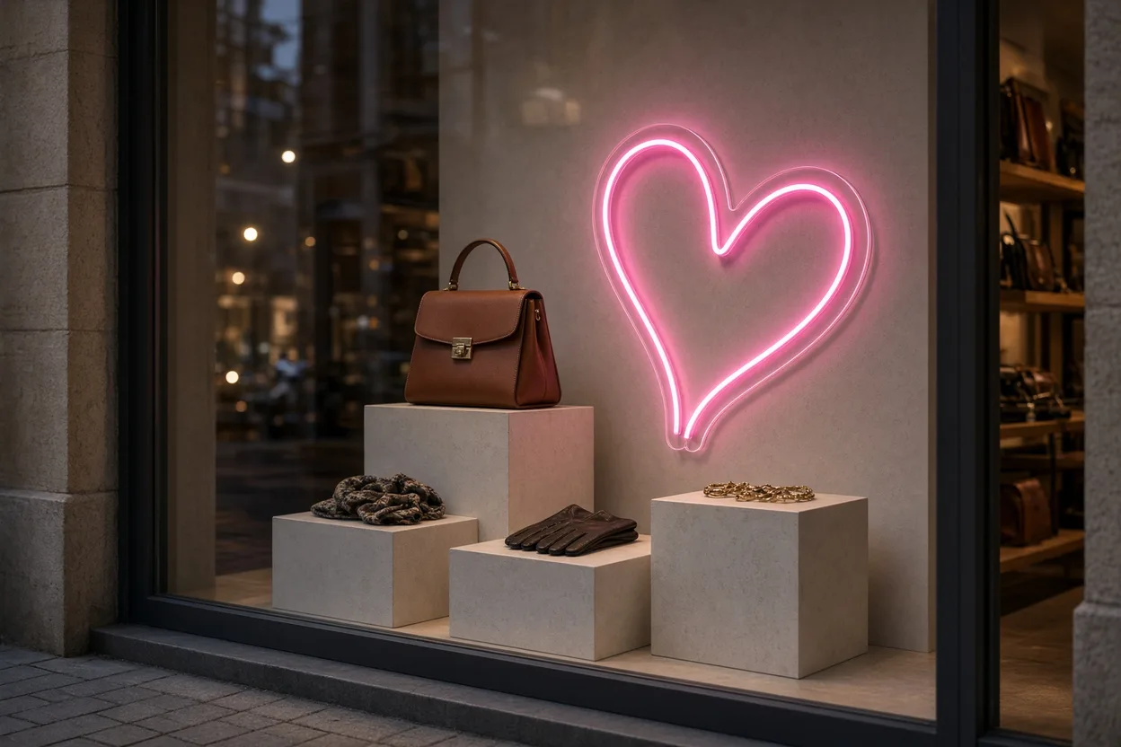
The classic mistake is to show the full assortment. The passerby retains nothing, while an open composition around one hero product draws the eye. The triangle rule, which places the main element at the top and secondary pieces below, helps build a balanced scene. For lighting, we detail the best placements in our article on neon signs for store windows.
- One theme: season, collection, event, or brand value
- Few products: one hero and a few supporting pieces
- Height: different levels to guide the eye
- Light: visible in full daylight and after closing
A lit window keeps working in the evening when the street is still busy. Plan for local rules: many cities and municipalities regulate illuminated signs and storefront lighting at night (required off hours). Check with your local municipality. Programming interior decorative lighting to those hours avoids surprises.
What role does lighting play in visual merchandising?
Lighting is the most powerful tool in commercial staging: it sets the mood, ranks zones, and reveals product color and material. IES (Illuminating Engineering Society) recommendations help guide retail lighting levels, but it is the contrast between general lighting and accent lighting that makes the essentials stand out.
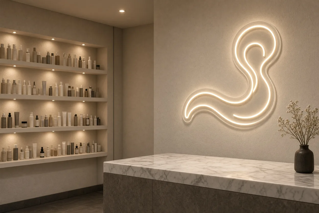
You therefore work with three levels: general light, which lets people see and move; accent light, which highlights key products; and decorative light, which carries the identity of the space. Color temperature matters too: a warm white, between 2,700 and 3,000 K, flatters wood, leather, or food, while a more neutral white suits cosmetics or tech. How colored hues affect mood is covered in our guide to neon color psychology.
- General: even ambient light so customers can move and read prices
- Accent: spots aimed at new arrivals and themed tables
- Decorative: a 12V neon or light line that signs the brand
- Color rendering: a CRI of at least 80, and 90 or higher for fashion and food
LED neon sits in that third family. It matches the brand’s exact typeface and color, runs on 12V, stays cool to the touch, and lasts 100,000 hours, which fits long opening hours. Well placed, it also becomes décor that customers photograph and share.
How do you build a visual merchandising strategy?
A commercial staging strategy is built in five steps: observe customers, define zones, set presentation rules, plan changes, and measure results. It does not require a large budget at the start, but it does need consistency in how rules are applied.
Observation is the most underestimated step. Spending an hour watching where customers stop, what they touch, and where they leave yields more insight than a theoretical floor plan. You spot cold zones, ignored fixtures, and obstacles that block traffic, then test one change at a time to measure the effect.
- Observe: real paths, stops, products touched, exits
- Zone: transition zone, call-out zone, aisles, zones to warm up
- Set rules: colors, heights, number of products per table
- Plan: a change calendar aligned with collections
- Measure: sales by zone and by product before and after each test
Permanent elements, such as fixtures, lighting, and brand signage, form the stable base of this strategy. Temporary elements, such as the window and themed tables, shift with the seasons. For customer wayfinding and display, our guide to store signage completes this approach.
Frequently asked questions about visual merchandising
What is the difference between merchandising and visual merchandising?
Merchandising covers all decisions about the in-store offer: assortment, quantities, pricing, and product placement. Visual merchandising is the visible part: it handles how that offer is presented to attract and persuade, through the window, staging, lighting, colors, and path. In practice, the two work together: merchandising chooses what to sell and where, and visual merchandising makes those products desirable.
What are the 4 pillars of merchandising?
Four pillars are often cited: the right product, in the right place, at the right time, at the right price, sometimes completed by the right quantity. Staging adds a presentation layer to these rules: window, layout, display, lighting, and signage. For a boutique, that means choosing which products to feature by season, placing them in the busiest zones, and presenting them clearly and attractively.
What is a hot zone in a store?
A hot zone is an area of the store that is naturally heavily trafficked: usually the entrance after a few steps, the main aisle, the checkout, and endcaps. That is where you place new arrivals, hero products, and impulse buys. Cold zones, often corners and the back of the store, need extra effort to draw customers, for example a strong display or a lit element such as a neon, visible from the entrance.
How do you do visual merchandising on a small budget?
Start by observing your customers and decluttering: fewer products, better presented, sell more. Build a window around a single theme, refresh it regularly, and feature a few products at eye level. Then work on lighting, which changes everything at limited cost: adjustable spots on key tables and a strong decorative element, such as a neon with your logo, that uses only a few watts and lasts 100,000 hours.
Is an LED neon useful in visual merchandising?
Yes, an LED neon is an effective staging tool in a boutique. It creates a focal point visible from the entrance, draws customers toward less trafficked zones, and displays the brand with its exact typeface and colors. It also becomes décor that is photographed and shared on social media. It runs on 12V, stays cool to the touch, and lasts 100,000 hours, which fits retail hours. For an exterior window, choose an IP65 model.
Visual merchandising turns a store into a journey: a window that stops the passerby, organized zones, well-presented products, and lighting that reveals what matters. To create the focal point for your boutique, explore our custom neon signs for stores, or send your logo via our contact page: you receive a free 3D mockup within 24 hours. Figures on purchase decisions come from the POPAI study.
Your custom neon, designed for free in 24 h
- Describe your ideaA text, a logo or a simple sketch. It takes one minute.
- Get your mockup and priceWithin 24 h by email, no commitment.
- Approve, we make itFree express delivery in 7 to 10 days, set up in 3 minutes.
- Mockup and price within 24 h, no commitment
- Free express delivery, received in 7 to 10 days
- 3-year warranty, set up in 3 minutes
Get your free mockup

Guillaume Schlupp
Founder of Helioneon
Over 10 years of entrepreneurship in premium interior design. 500+ LED neons delivered across 13 countries under Helioneon and Light Genius. Leads product strategy, design and professional accounts.