Neon Color Psychology: Which Color Creates Which Mood?

- Red and orange fuel energy and appetite, blue calms and builds trust, green restores balance, pink and purple invite play or creativity, and white or yellow read as elegant or optimistic. Choose the feeling first.
- You get hue-by-hue guidance for home and business, plus practical notes on dimming, walls, and one-versus-two color setups.
Neon colors shape mood in predictable ways: red and orange bring energy and appetite, blue calms and builds trust, green suggests nature and balance, pink reads as playful and soft, purple signals creativity, and white delivers understated elegance. Pick the emotion first, then the color follows almost automatically.
Color psychology is one of the oldest tools in interior design and retail, and a glowing sign amplifies it, because the color isn't just on the wall, it fills the air around it. That's exactly why we offer a wide color range when you design your own neon sign at Helioneon, with a free 3D mockup within 24 hours so you can test the mood before committing.

Does color really change how a room feels?
Yes, and the evidence goes beyond taste. Researchers have measured physiological responses to color for over a century: exposure to red has repeatedly been linked to raised arousal and attention, while blue environments are associated with lower reported stress. Marketers noticed early. It is no accident that so many fast-food giants built their branding on red and yellow, two colors long associated with appetite and urgency.
One frequently cited experiment, published in Science in 2009 by researchers at the University of British Columbia, found that people performed detail-focused tasks better in front of red screens and creative tasks better in front of blue ones. Light nudges behavior, in other words, even when nobody notices it happening. A neon sign won't rewire anyone. It tilts the room, and rooms tilt people.
A caveat before the tour, though. Context and culture bend these rules, and personal memory bends them harder. Broad patterns hold often enough to be useful, so treat what follows as a strong starting point rather than a law of physics.
The Wikipedia entry titled Color psychology summarizes research on how hues link to emotion and behavior across lab work and design practice. Treat it as background context for the practical room choices in this guide.
Red and orange: energy, appetite, urgency
Red is the loudest color in the room, always. It raises the pulse of a space, draws the eye first and carries associations of passion, heat and hunger. Orange keeps most of that energy and swaps the intensity for friendliness.
At home, red neon suits a bar cart corner, a home cinema or a bold statement wall, though I'd ration it: one red piece per room is plenty. For businesses, it's a gift. Restaurants, takeaways, cocktail bars and music venues have used red and orange glow for a century, from the earliest Parisian signs of the 1910s onwards, because nothing says open, warm and alive quite like it.

Blue: calm, trust and depth
Blue is red's opposite in nearly every measurable way. Surveys across dozens of countries have found it to be the world's most commonly named favorite color, and brands lean on it whenever they want to look dependable: banks, tech firms, healthcare.
In neon form, blue turns a room contemplative. Ice blue over a desk keeps a workspace cool-headed, and deep blue in a lounge feels like dusk stretched out for hours. Gaming setups love it too. For commercial spaces, blue suits barbershops, spas, dental studios and anywhere trust matters more than impulse. One warning from experience: blue light late at night can fight your sleep, so in bedrooms, dim it or pick warmer shades.
Green: nature, balance, permission to breathe
Green sits in the exact middle of the visible spectrum, around 550 nanometers, and the human eye distinguishes more shades of it than of any other color. Evolution spent a long time teaching us that green means growth, water nearby, safety.
A green neon leaf or phrase pairs beautifully with houseplants and natural wood, which is why plant-filled interiors adopted the look so fast. Commercially, green fits juice bars, vegan restaurants, florists, yoga studios and eco-minded brands. Mint green in particular is having a long moment in 2026, and unlike most trends, I think this one has legs, because it flatters both white walls and dark ones. Deep emerald, its moodier cousin, does the same job for bars and studies that want calm with a bit of drama attached.

Pink and purple: play, romance, imagination
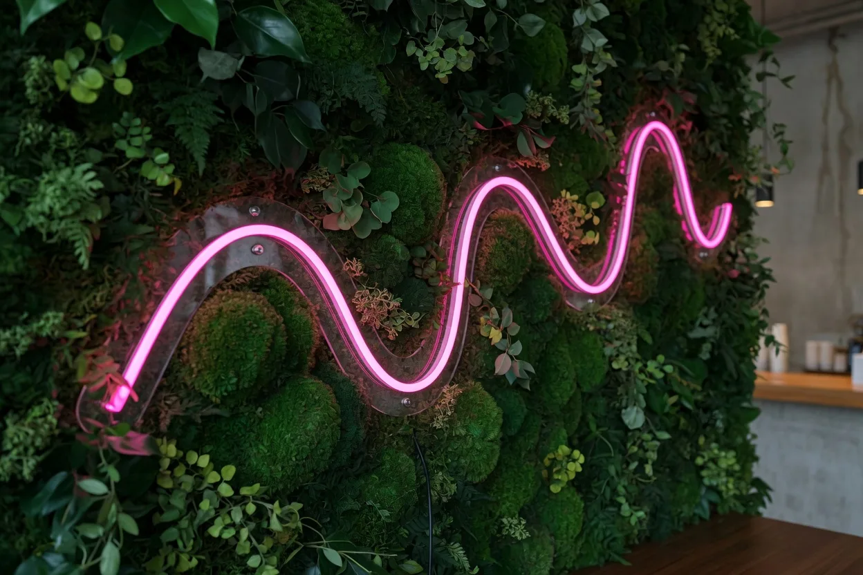
Pink is the signature neon color of the social media era. It reads as warm, fun and slightly nostalgic, and it photographs better than almost anything else on this list. Soft pink flatters skin tones, which is one reason wedding photographers keep asking couples to stand next to it.
Purple carries different freight: creativity, luxury, a hint of mystery. Historically it was the most expensive dye in the ancient world, reserved for royalty, and some of that association survives. At home, pink owns bedrooms and dressing corners while purple suits studios and creative spaces. For business, pink pulls selfies in cafes, salons and boutiques, and purple gives cocktail bars and beauty brands their after-dark polish. Our bedroom neon ideas lean heavily on this pair, for good reason.
White and yellow: elegance and optimism
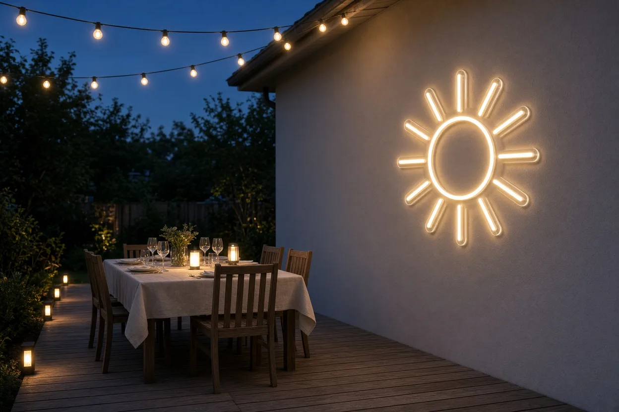
White is the quiet sophisticate of neon. A warm white script phrase reads as candlelight with better handwriting, and it survives every redecoration, every trend cycle, every change of sofa. If a sign has to last a marriage, make it white. Yellow, meanwhile, is bottled optimism: sunshine, humor, energy without red's aggression.
White suits weddings, minimalist interiors and upmarket retail. Yellow suits kids' play corners, breakfast cafes and any brand built on cheerfulness. Since white comes in warm and cool variants with genuinely different moods, it deserves its own decision, and our guide on how to choose a neon sign covers that fork in the road.
Multicolor deserves a mention too. Some designs combine two or three shades in one piece, a script word in pink with a yellow lightning bolt, say, and the pairing reads as festive and youthful. It suits party walls, play corners and event backdrops. Treat it like seasoning, though: two colors converse, four colors shout over each other.
When white is your final pick, the warm versus cool split shapes the mood as much as the wording. Soft warm white settles a living room the way candlelight would, while cool white keeps retail edges crisp. Compare both looks in our guide on warm white vs cool white neon before you lock the shade.
Choosing for home vs choosing for business
At home, please ignore the trend cycle and answer one question: how do you want the room to feel at 9pm? Calm points to blue, green or warm white. Playful points to pink or yellow. Intimate points to red, dimmed low. You live with the color every evening, so the 100,000-hour lifespan of an LED neon tube means this choice will comfortably outlast your current wallpaper.
Lighting context finishes the job. A color reads differently over a dark feature wall than over white paint, and dimming changes its character again: hot pink at 100% is a party, hot pink at 15% is a boudoir. So test your shortlist at night, with the main lights off, before deciding anything.
For a business, flip the logic: how should a customer feel in the first five seconds? Hungry, calm, pampered, excited? Match the color to that answer, then check it against your brand palette so the sign looks deliberate rather than decorative. A spa with a red sign is sending mixed signals. A burger joint with an ice-blue one is too. Get the emotion right and the color does silent sales work every single day.

One neon color or two?
One strong color usually carries a room. Two can work when they share a job: pink script with a small warm white outline, or a blue wave beside a soft white moon. Keep a clear hierarchy so one hue leads and the other supports.
Skip random rainbow stacks on a single wall. They photograph busy and dilute the mood you picked in the first place. If the brief is a party backdrop, two or three planned shades are enough. For daily living, one color plus dimming gives you more moods than a multicolor piece left on full blast.
Size changes the equation. A small blue icon whispers. A large blue word owns the sightline. Match scale to the emotion: quiet colors can run larger; loud colors often look better as a focused accent. LED neon on a silicone tube over an acrylic backing, running on 12 V, stays cool enough for close placement, so you can size for mood rather than heat.
Wall color, ambient light, and your neon
Neon does not sit on a blank canvas. A red sign on charcoal paints the air hotter than the same red on white. Dark walls drink light and make the glow feel denser. Pale walls bounce it and spread the mood farther into the room.
Existing lamps matter too. Cool ceiling LEDs pull a warm white neon toward neutral. Warm bulbs push pink and orange into a cozier register. Test at night with overheads off, then with them on, so you know both versions of the room.
A simple pairing map helps:
- Dark walls: emerald, deep blue, warm white, muted pink
- White or cream walls: almost any hue; yellow and ice blue stay crisp
- Wood and plants: green first, then warm white or soft orange
- Mixed lamp layers: keep the neon to one hero color so the room stays readable
For layouts that already balance glow with lamps and daylight, use the neon decor room-by-room guide. Lock the final shade only after you have seen it against your real wall color at night.
How dimming reshapes neon color mood
Same hue, different volume. At full power, red feels urgent and public. At a low setting, it turns intimate and slow. Pink follows the same path: bright reads party, soft reads private.
Blue is the reverse trap. Full ice blue keeps a desk sharp. Dimmed deep blue can feel almost theatrical, like a late lounge. Warm white stays gentle across the range, which is why it works in bedrooms when cooler blues fight sleep.
Think in three stops when you plan the evening look:
- High: storefronts, photo walls, open energy
- Mid: living rooms and work nooks where you still need focus
- Low: late evenings, bedrooms, cocktail corners
If you want plain talk on output levels, read how bright LED neon signs are, including lumens and dimmers. Then preview the shade on the free 3D mockup before you commit.
FAQ: neon color psychology
What is the most calming neon color?
Blue is the most consistently calming, followed closely by green and warm white. Blue environments are associated with lower reported stress, while green carries restful associations with nature. For bedrooms, warm white dimmed low is often the most soothing choice of all.
Which neon color attracts the most customers?
Red and orange grab attention fastest and are strongly linked to appetite and impulse, which is why food businesses favour them. But attraction should match your offer: pink pulls photo-driven foot traffic to cafes and salons, while blue builds trust for service businesses.
What does a pink neon sign mean?
Pink signals playfulness, warmth and romance, with a dose of retro nostalgia. It is the most photographed neon color of the social media era, flattering to skin tones and instantly recognizable. That makes it a favorite for bedrooms, weddings, cafes and beauty spaces.
Can a neon color affect sleep?
Yes. Cooler, bluer light in the evening is widely reported to delay sleepiness more than warm light. If a sign lives in your bedroom, choose warm white, soft pink or another warm shade, and use the dimmer to bring intensity right down before sleep.
Should my neon sign match my brand colors?
Ideally yes, or at least harmonise with them. A sign in your exact brand shade reinforces recognition every time someone photographs it. If your brand color renders poorly as light, pick the nearest neon-friendly shade and preview it on a free 3D mockup first.
Your custom neon, designed for free in 24 h
- Describe your ideaA text, a logo or a simple sketch. It takes one minute.
- Get your mockup and priceWithin 24 h by email, no commitment.
- Approve, we make itFree express delivery in 7 to 10 days, set up in 3 minutes.
- Mockup and price within 24 h, no commitment
- Free express delivery, received in 7 to 10 days
- 3-year warranty, set up in 3 minutes
Get your free mockup

Guillaume Schlupp
Founder of Helioneon
Over 10 years of entrepreneurship in premium interior design. 500+ LED neons delivered across 13 countries under Helioneon and Light Genius. Leads product strategy, design and professional accounts.