Neon Aesthetic Styles: Cyberpunk, Retro, Minimalist and Y2K
⚡ The essentials in 30 seconds
- From cyberpunk blues to Y2K pinks: the five defining neon aesthetic styles, what makes each one work, and how to bring your favourite into a home or business.
Five aesthetics dominate neon in 2026: cyberpunk (electric blues, purples and pinks), retro Americana (diner reds and oranges), minimalist (a single warm white line), Y2K (bubblegum pink, butterflies, hearts) and Japanese citypop (layered signs, kanji, dusk tones). Each has clear rules, and each is easy to get right once you know them.
Neon isn't one look. The same technology reads as 2077 or 1957 depending entirely on colour, typography and context, which is why the style decision matters more than the size one. At Helioneon we build all five aesthetics from the same 6 mm silicone tube, and you can design your own neon sign in any of them, with a free 3D mockup within 24 hours to check the vibe before production.
Why neon defines an aesthetic so strongly
Light carries memory better than furniture does. A red glow summons 1950s America; a blue-pink haze summons rainy futures we've only seen in films. Directors have exploited this for decades, and interiors borrowed the trick: one glowing object can set a room's entire era and mood, then the rest of the decor just has to agree with it.
That's the practical power of choosing a style deliberately. Pick the aesthetic first, and every later decision (colour, font, phrase, placement) mostly makes itself.
Cinema proved the point decades ago. Wong Kar-wai's Hong Kong films of the 1990s and the neon-soaked Tokyo of Lost in Translation (2003) each built entire emotional worlds from glowing signage, and set designers still reach for neon whenever a single light has to carry a whole mood. Your living room works on the same principle, at rather lower stakes.
Cyberpunk: the future in blue and violet
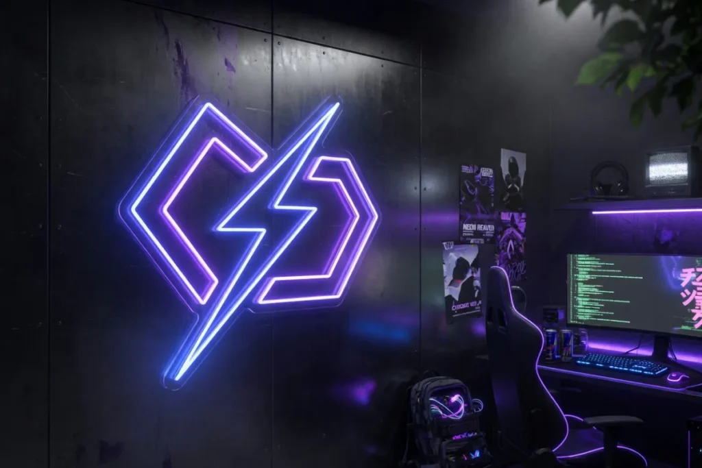
The look of Blade Runner (1982) and four decades of its descendants: dense electric colour against darkness, technology as atmosphere. The palette is strict, and that strictness is the style: electric blue, violet, magenta and ice white, never warm domestic tones. Typography leans angular, uppercase, sometimes glitch-styled, and katakana or kanji accents are part of the visual language.
At home it belongs to gaming rooms and home cinemas: a blue-violet sign above the desk, dark walls, maybe a purple accent strip behind the monitors. For businesses, esports venues, vape shops, tattoo studios and late-night bars wear it naturally. My one warning: cyberpunk needs darkness to breathe, so in a bright beige room it just looks like a lost prop. Commit to the dark backdrop or choose another style.
Retro Americana: diners, motels and Route 66
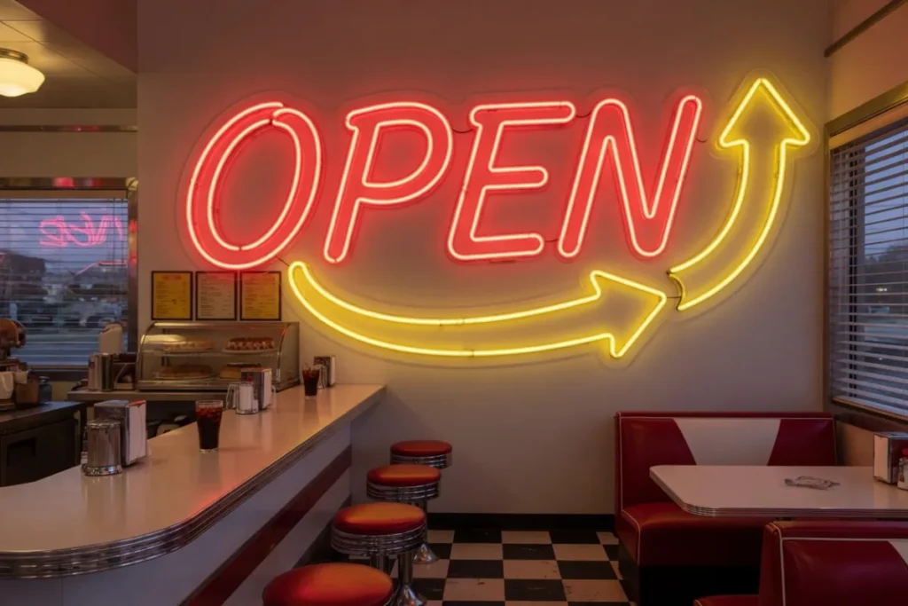
This is neon's homeland, the golden age of the 1930s to 1950s when American roadsides glowed with motel arrows and diner script. The palette runs hot: red, orange, warm yellow, turquoise as the classic accent. Typography is the signature: rounded retro scripts and bold outlined capitals, often with borders, arrows and starbursts around the words.
At home it makes kitchens and bar corners sing: "Diner", "Eat", a glowing arrow, your surname styled like a 1955 motel. Commercially it's a gift to burger joints, barbershops, breweries and anywhere trading on nostalgia. It pairs best with chrome, checkerboard floors and leather booths, and even one of those three is enough to anchor it. Of the five styles, this one ages most gracefully, because it was already vintage when it arrived.
Minimalist: one line, warm white, nothing else
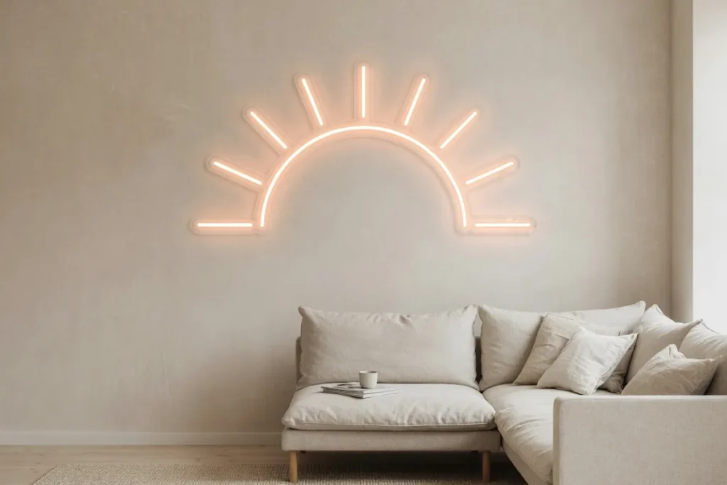
The anti-neon neon, and quietly the most ordered aesthetic of the 2020s. A single thin line of warm white or soft pink script on a plain wall: one word, lowercase, generous empty space around it. The style borrows from gallery lighting and Scandinavian restraint, and its whole power is what it leaves out.
It suits almost every modern home, which explains its dominance: above a bed ("breathe"), in a hallway ("hello"), over a dining table ("gather"). Our bedroom neon ideas lean heavily minimalist for good reason. For businesses, boutiques, studios and cafes with pared-back interiors wear it well. The discipline: one sign per room, three words maximum, warm white or the palest pink. Add a second colour and you've left the style.
Sizing is part of the discipline too. Minimalist pieces usually run smaller, 50 to 80 cm wide, and they sit best centred over the key piece of furniture with at least a hand-span of clear wall on every side. Resist the urge to fill the space around them. The emptiness is doing half the work.
Y2K: bubblegum futurism is back
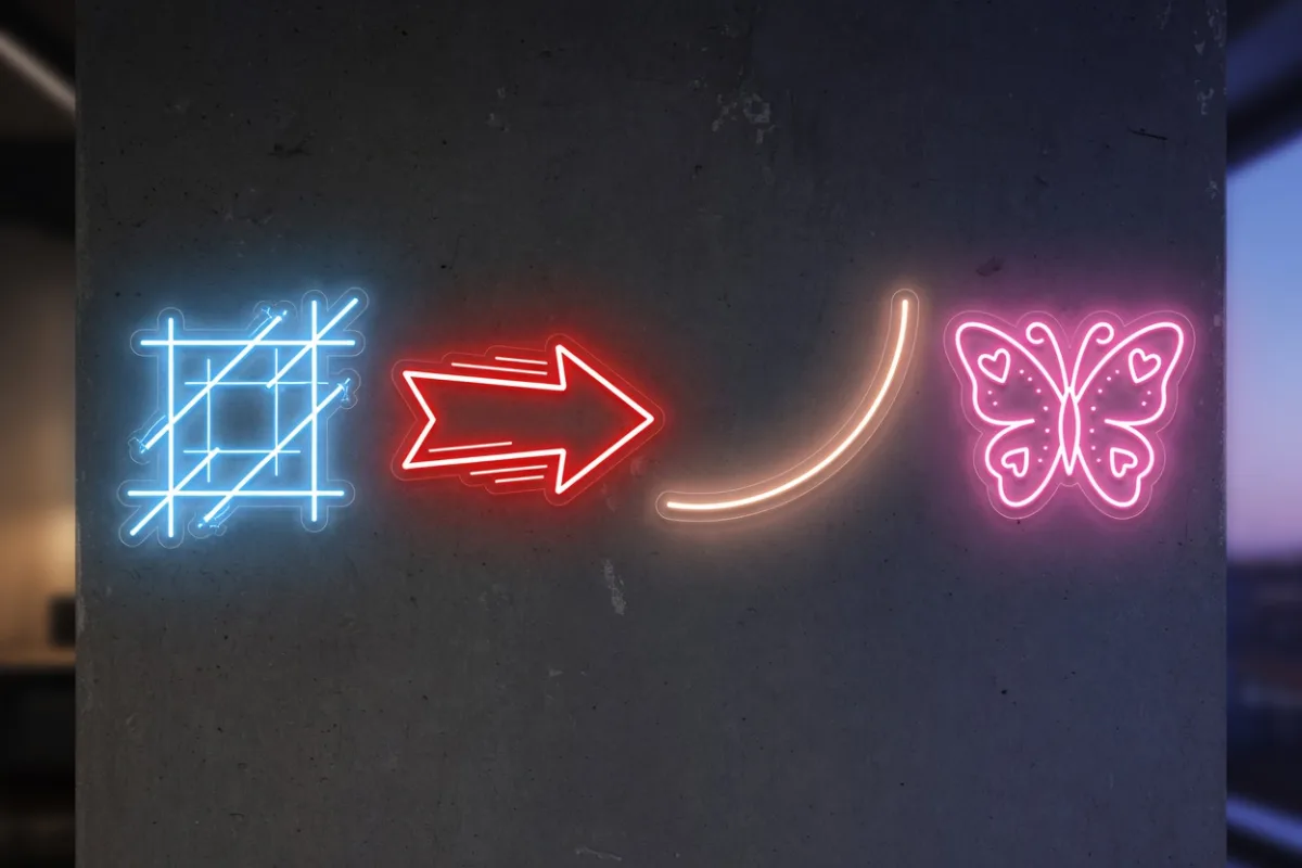
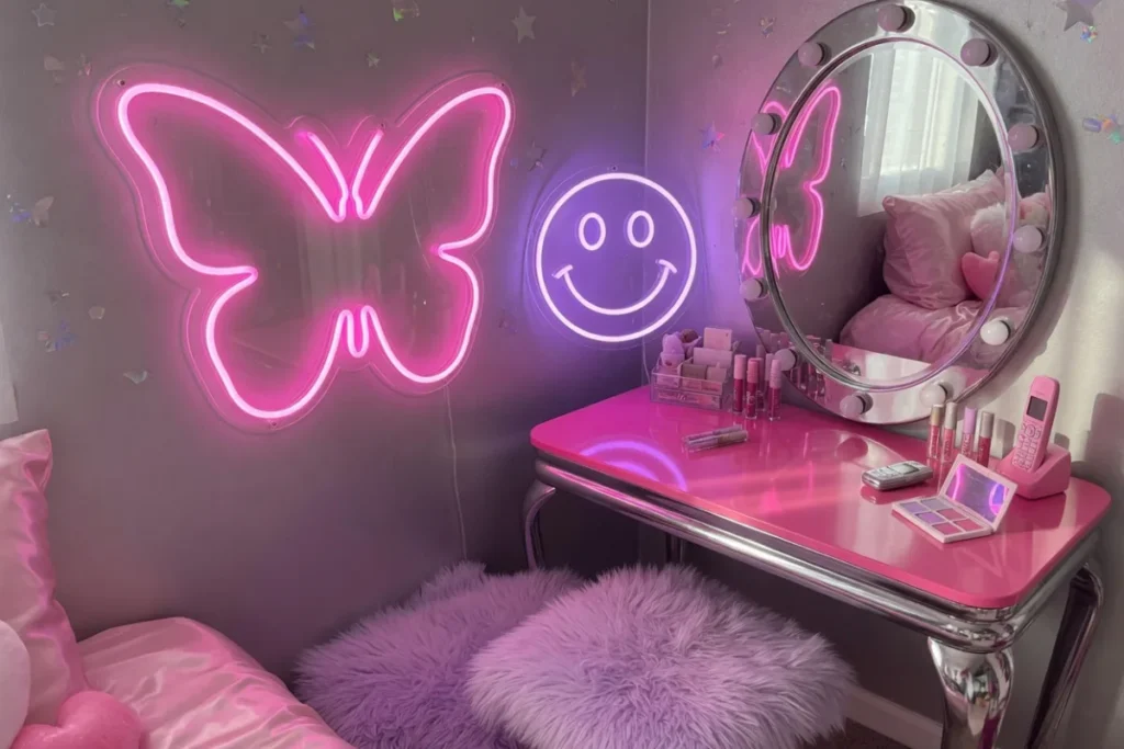
The year 2000 aesthetic returned around 2021 and refuses to leave: bubblegum pink, lilac and baby blue, chrome accents, and motifs over words. Butterflies, hearts, stars, cherries, flip-phone-era iconography rendered in glow. Where minimalism whispers, Y2K giggles.
It thrives in bedrooms, dressing corners and content-creation setups, usually as a pink butterfly or heart beside a mirror. Commercially it's the reigning look for nail bars, lash studios, bubble tea shops and boutiques chasing a Gen Z audience, and it photographs like nothing else on this list. Two rules keep it fun rather than chaotic: pastels only (hot red breaks the spell), and pair the glow with at least one reflective surface, chrome or mirror, for the full millennium effect.
Word choice follows the mood: "angel", "dream girl", "no bad days" and single initials all fit, and lowercase rounded fonts keep the softness. If the sign will star in videos, test it against your ring light's colour temperature first, because pastel pink can wash out under very cool light.
Japanese citypop: dusk, layers and lanterns
The most atmospheric of the five, drawn from 1980s Tokyo: layered vertical signs, kanji and katakana, warm reds and oranges bleeding into cool blues, the feeling of a side street at dusk. The style is less about one sign than about depth, light at different heights and intensities, like a street compressed into a room.
At home it suits listening rooms, studies and balconies: a vertical sign with a favourite word in kanji, a warm lantern nearby, wood and paper textures around it. Restaurants, ramen bars and izakaya-style venues in the UK have adopted it enthusiastically, and honestly, it's the style I'd bet on growing most through the late 2020s. One caution born of experience: translate carefully. If you're hanging kanji, verify the meaning with a native speaker before the mockup stage, not after delivery.
Start small if the style tempts you but the commitment scares you: a single vertical word beside a bookshelf, warm red or amber, main lights dimmed. Citypop rewards layering over time, and one good sign is a perfectly legitimate first layer.
How to choose and commit
Match the style to the room you actually have, not the room in your saved posts. Dark and moody supports cyberpunk or citypop. Bright and airy wants minimalist or Y2K. Nostalgic materials (wood, chrome, leather) call for Americana. Then commit fully: the common failure is mixing three aesthetics at 30% each, which reads as clutter rather than character.
The good news is that commitment is cheap to test and durable to keep. A free 3D mockup within 24 hours shows your phrase in the style before anything is made, delivery takes 7 days, and the tube's roughly 100,000-hour lifespan with a 3-year warranty means your chosen aesthetic will still be glowing when the trend cycle comes back around to it. For the practical decisions that follow (size, font, colour, placement), our guide on how to choose a neon sign picks up where this one ends. And if you're curious why these looks all migrated from fragile glass to silicone LED in the first place, the glass vs LED comparison tells that story.
FAQ: neon aesthetic styles
What colours are cyberpunk neon?
Electric blue, violet, magenta and ice white, always against dark backgrounds. The palette comes from films like Blade Runner and decades of gaming culture. Warm domestic tones break the style, so keep the room dark and the colours cool.
What is the Y2K neon aesthetic?
A revival of year-2000 visual culture: bubblegum pink, lilac and baby blue glow, with butterflies, hearts, stars and cherries as the main motifs. It pairs with chrome and mirrors, suits bedrooms and beauty businesses, and is the most photographed neon style on social media.
Which neon style ages best?
Minimalist warm white and retro Americana age best. Minimalism survives redecoration because it commits to so little, while Americana was born nostalgic and can't really go out of date. Trend-driven styles like Y2K carry more fashion risk over a sign's decades-long life.
Can I mix neon aesthetics in one room?
Better not. Mixing styles at partial strength usually reads as clutter rather than character. Choose one aesthetic per room and commit to its palette and typography. If you love two styles, give each its own room and let doorways do the transitions.
What font suits a retro neon sign?
Rounded 1950s-style scripts and bold outlined capitals define the retro Americana look, often framed with borders, arrows or starbursts. Warm colours complete it: red, orange or turquoise. A free 3D mockup lets you compare two retro fonts side by side before ordering.